Outline
SimCity for Real Life
Outline was an application designed to provide citizens with a way to easily explore and create public policy proposals. We transformed an existing process that required expert level knowledge and weeks of processing time into a process that could be used by any citizen and produced results in under a second.
By creating custom visualizations that effectively communicated personal financial impacts and by designing loading bars to communicate calculation progress, users trusted the platform.
SimCity for Real Life
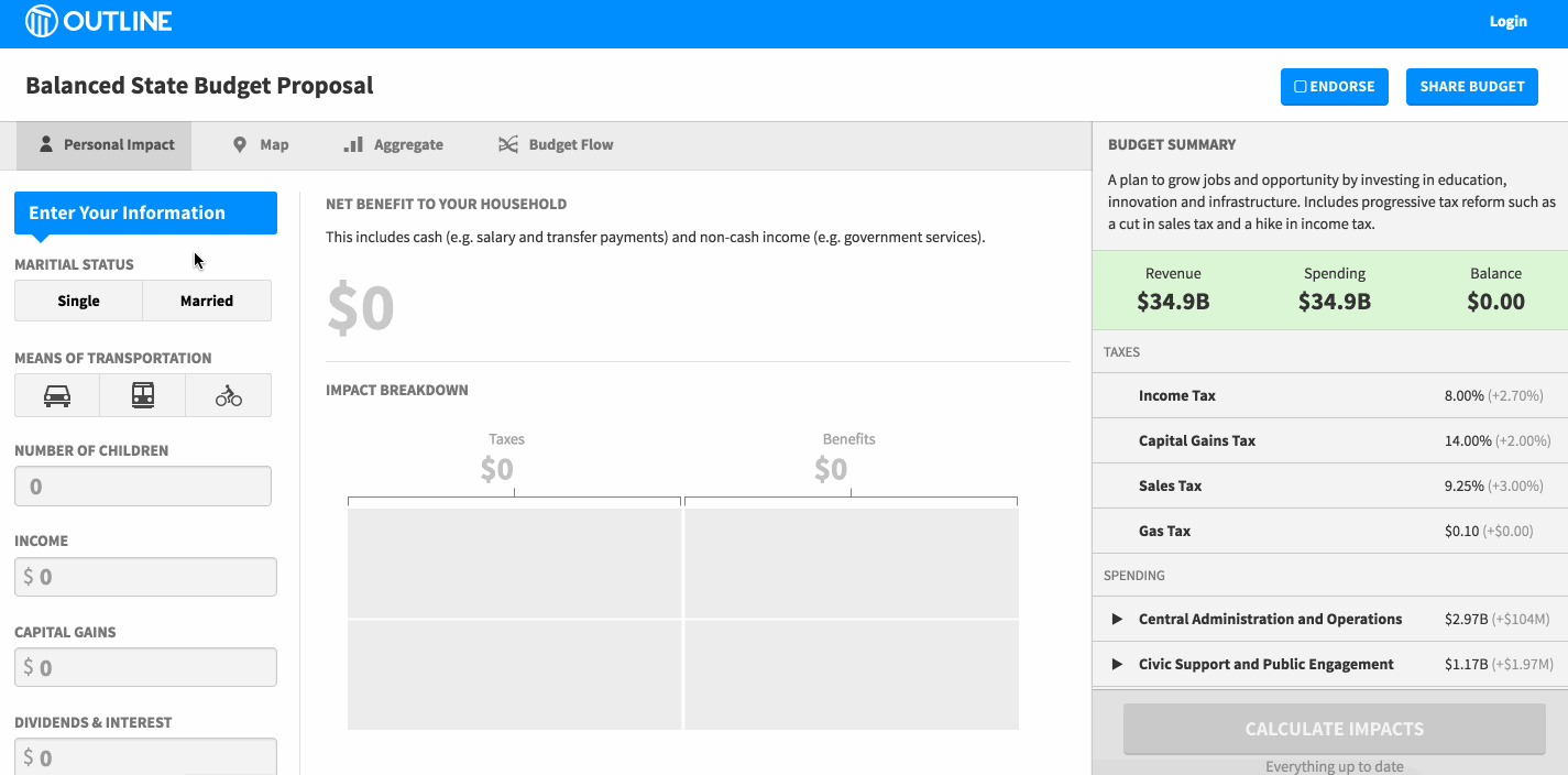
Outline was designed to provide consumer friendly insights into public policies, such as state budgets. It visualized how policies will financially impact you, your community, and government at large.
Challenges
Outline faced two big design challenges:
- Visualizing Impacts - Communicating a proposal's financial impact on an individual, on your community, and on government itself
- Making the data processing speed feel believable
There were many other challenges, from technical to political, but this page focuses on the two aforementioned user experiences hurdles.
1. Visualizing Impacts
Outline's goal was to build "SimCity" for real life. For this project, our goals preceded our visualization design decisions. We knew the kind of data we wanted to show, so we designed the app as we concurrently honed in on the best way to show the data. To do this required designing multiple visualizations to achieve four different goals:
- Visualizing personal financial impact
- Visualizing community impact
- Visualizing financial impact on the budget itself
Visualizing Personal Impacts
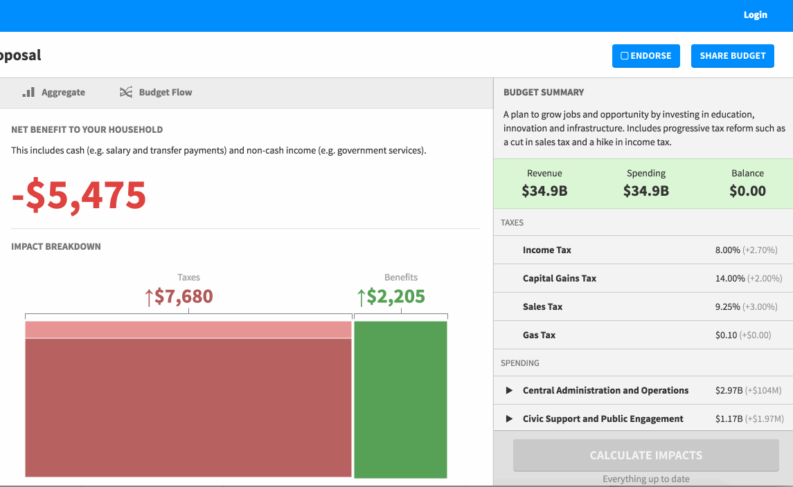
This visualization was the most critical as it is most directly relevant to the user. I wanted to communicate, in a single visualization, both the net spending and tax burden, as well as the components of each.
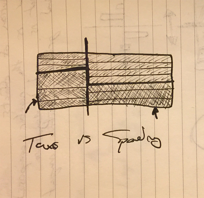
I wanted to use a visualization that had a high "data-ink" density, that communicated a sense of trust and did not compromise to be more appealing. So for example, donut charts would not fit this requirement. Both tax and spending impacts impacts needed to be communicated cohesively, along with individual breakdowns for each category. Another core piece of data that needed to be communicated was the calculation: taxes plus spending equal the total financial impact.
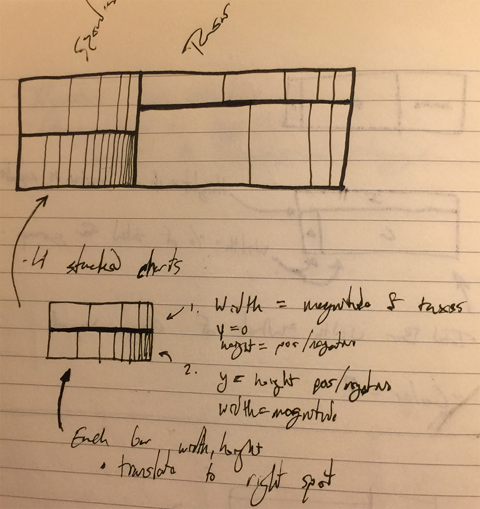
Early Sketches of Personal Impact Visualization
I ended up creating a combination of a treemap combined with a stacked bar chart. The horizontal bar represented the amount of taxes vs spending, and the interior vertical bars represented sub-items for each group. The final result preserved area, allowing the user to quickly glance at it to get a sense of the impact, while allowing them to drill down to see individual component effects (e.g., tax -> income tax). On mousing over an area, information is provided on demand.
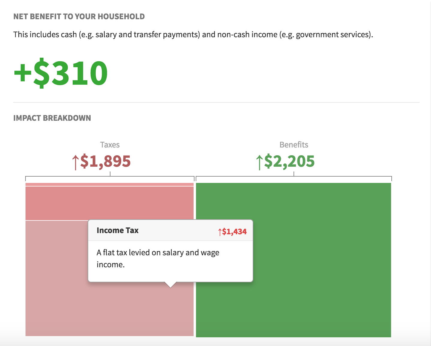
Combined personal financial impact visualization.
Personal financial impacts are comprised of tax burden + benefits. Outline was designed to provide users a way to edit budgets, so the impacts being visualized are "diffs" of budget proposals. If a newly proposed budget were to lower the rate rate, the visualization would update correspondingly.
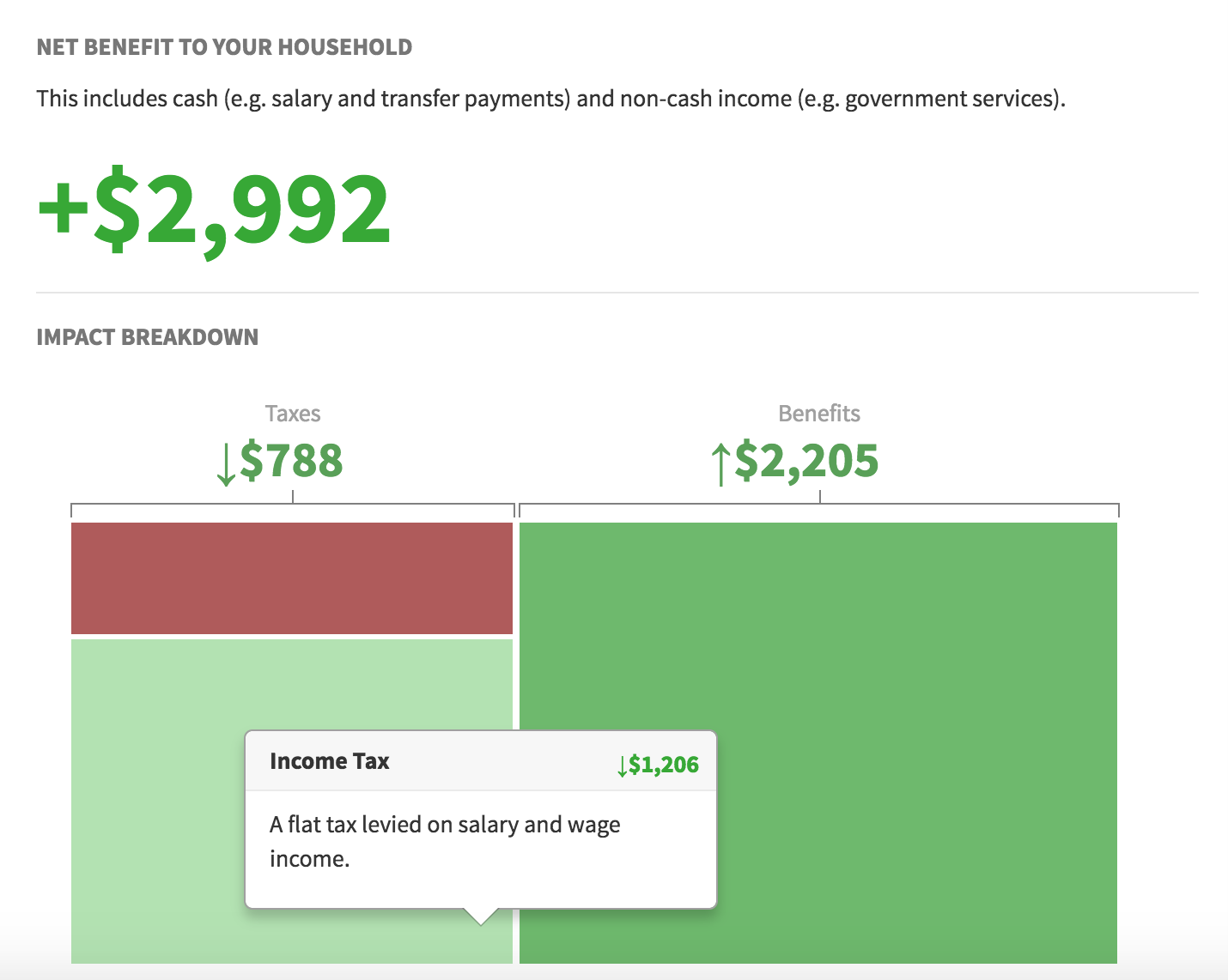
Effect of a budget proposal lowering taxes
The visualization was able to effectively communicate the impacts of budgets and because of it looked like more "scientific" than a donut chart. Because of its accuracy, it could be trusted. While it may be unclear at first, it delivers a powerful hook in the form of big red and green boxes. These can then be explored, and the complexity is gradually understood.
Visualizing Community Impacts
The second challenge was communicating how a budget proposal impacted people in your community. Before pursuing any options, it was important to decide at a high level what type of information should be shown. After pursuing a number of possible routes, the final version used a traditional choropleth map best and income quintile visualization.
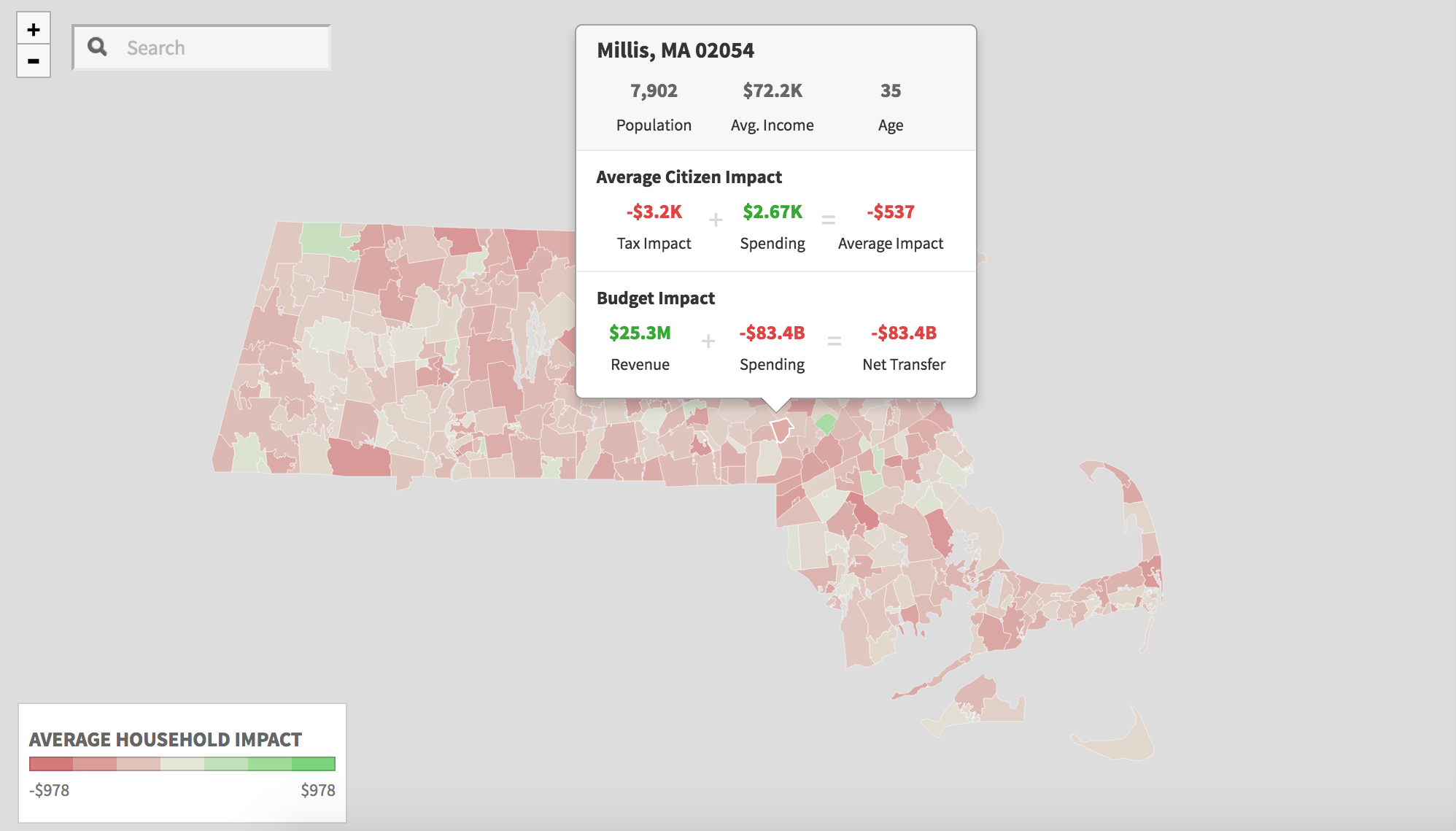
Choropleth Map of budget impact
The choropleth map was bucketed by counties. For each county, a number of calculations were additionally made to show the impact of a representative citizen, along with the budget impact for that individual county. A diverging legend was used so the positive or negative effects could be communicated. These calculations would be updated for every simulated tax record in the state as the user updated the budget.
This worked very well to give a high level view of impact by location, but alone it is not enough to paint a clear picture. Income distribution can be seen implicitly through geography, but as our chief goal was to visualize financial impacts, we needed another visualization to slice the data by income.
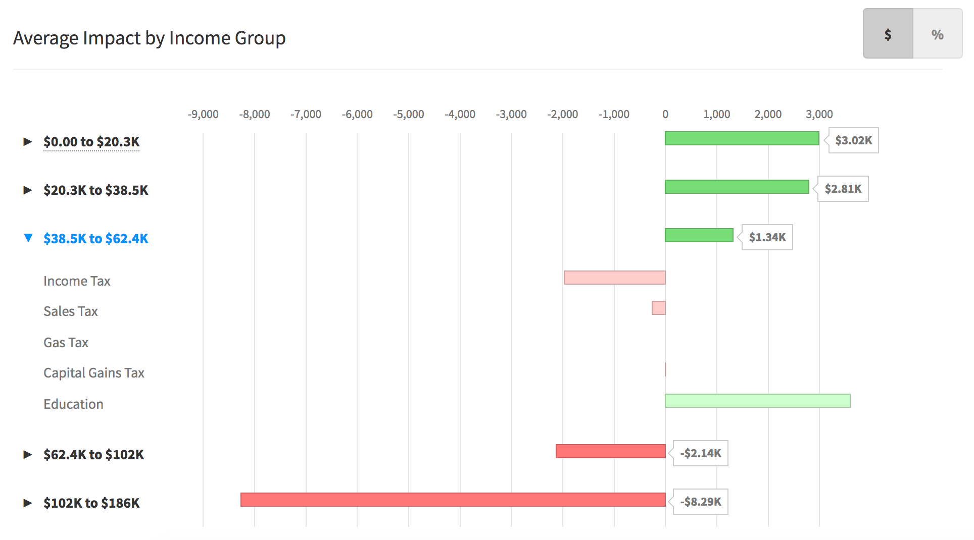
Aggregate bar chart of impacts grouped by income level, by raw amount
The second visualization used was a standard bar chart, with a scale ranging from the lowest negative to highest positive values, broken down by income quintiles. It is further expandable to see the impacts of any proposed budget changes. In the example above, citizens with a combined household income of $38,500 to $62,400 would receive a net positive effect of $1,3400 because of the proposed budget changed. They would suffer a net negative impact from taxes, largely income tax, but receive a positive benefit due to education spending which would offset their tax burden.
This chart presented a political problem. Because of the political nature of budgets, showing either raw numbers or percentages alone could shape the narrative. A full picture can be provided only by looking at both percentage and raw spending. Therefore, it was critical to add a button to toggle between the two views.
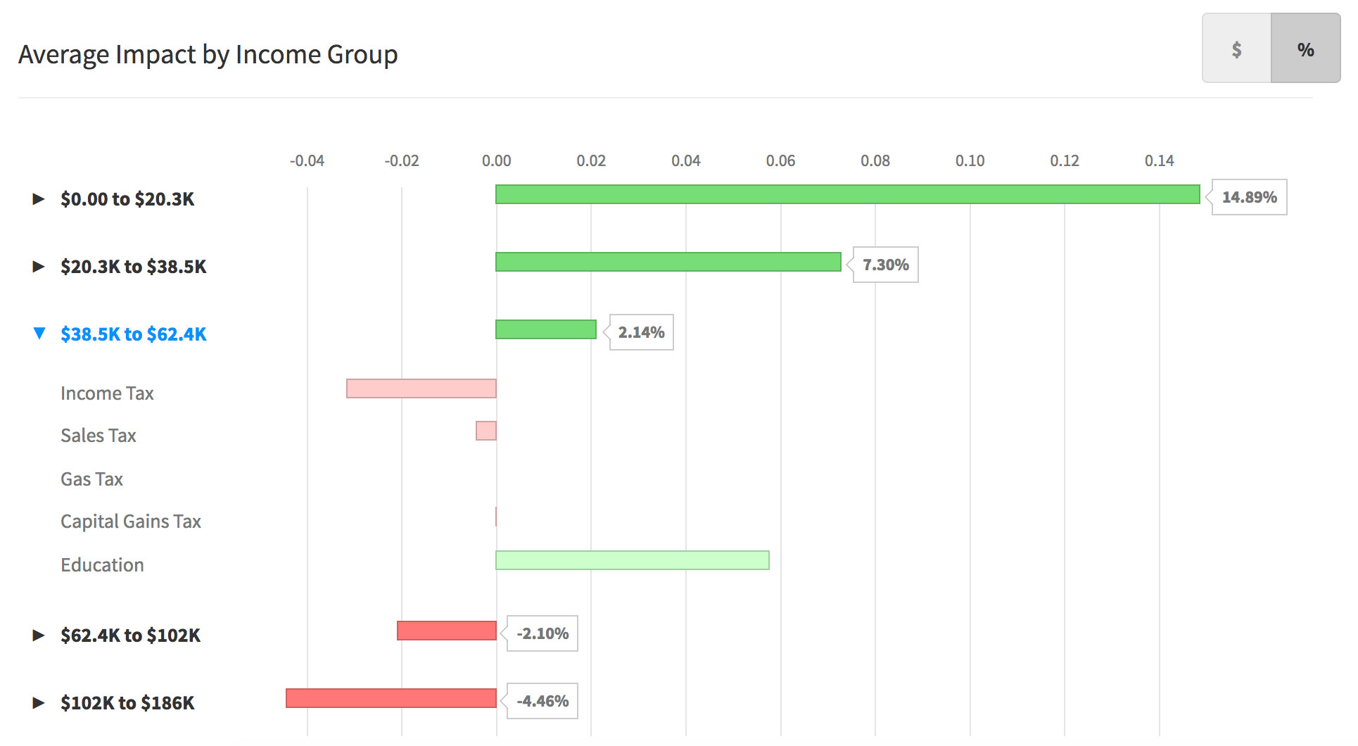
Aggregate bar chart of impacts grouped by income level, by raw amount
Visualizing Government Impacts
Lastly, our third goal was to communicate the financial impact on the state's budget itself. Because of the importance of "balancing the budget," it was critical to show a high level summary as often as possible. Secondly, users needed to be able to drill down and see how the budget was broken down.
To accomplish an omni-present summary, the revenue, spending, and budget balance was shown at all times in the "Budget Summary" and input side-pane. Whenever any inputs (e.g., income tax) were changed, the budget values would be updated immediately, along with any on screen visualizations.
For the budget breakdown, I wanted a visualization that would be both accurate but novel enough to be presentable outside of the app. Something that could be used as an interesting hook. The budget is a prototypical flow chart, of money coming in vs. going out. A Sankey diagram was used. While it is not a rare visualization or entirely novel visualization, it is uncommon enough to give many people a pause.
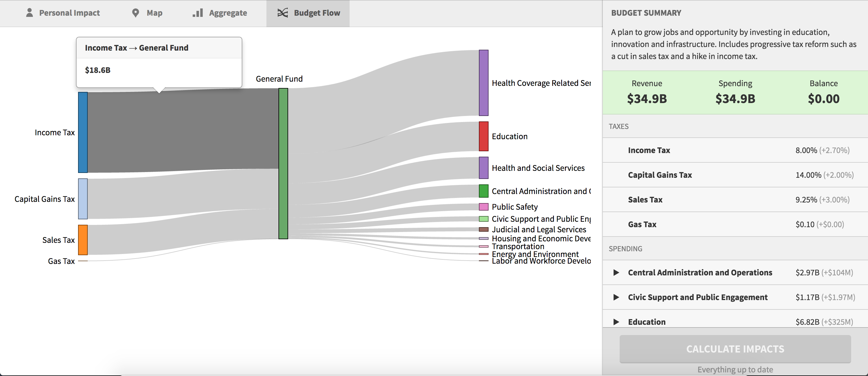
A Sankey diagram of the budget breakdown. On mouseover, more information is provided for each flow. The side-pane lists the incoming (revenue) vs outgoing (spending) values, along with their sum (the budget's balance).
Aesthetic choices and visualizations are not enough to convey trust. But a product must not only look trustworthy, it must feel trustworthy.
2. Making the Processing Speed Believable
We faced an ironic problem with Outline. It was too fast. In an earlier iteration of the product, the policy impacts would be calculated as you dragged. The problem was that nobody believed calculations were actually happening.
Most traditional budget policy micosimulators require expert level knowledge to use and can take days to run. We wanted to fix that. This was one of the technical challenges I solved that won't be discussed in detail here, but it involved using parallel computing, using OpenCL and GPU programming (my blog posts on OpenCL).
The final implementation was a dramatic improvement. Because our simulator leveraged GPU programming, what used to take days now took fractions of a second. The 95th percentile for request time was under 200ms, so it was close enough perceptually to feel as if it were happening virtually in real time.
The first design decision was simply to hook up the inputs directly to the simulator and update visualizations on the fly. While it felt great, it failed to achieve its goal on its own: people did not believe the calculations, especially those at the state level, were actually happening.
Solution
The final version put all calculations behind a big "calculate" button and show a fake loading bar
Calculation Process
This was an unusual design problem I had not faced before. I almost universally tried to avoid loading bars, to avoid unobtrusive obstacles in design. In most cases, loading bars are a technical artifact that stymie a user's goals and burden the interface.
But, design should stand on its own. If people did not believe the calculations were happening because it was too fast, the speed doesn't matter. The design was not believed. To make it believable, two solutions were implemented.
First, an extra step was added to the slider. Before showing any results, the visualizations would become disabled as soon as any change was made. This communicated that the policy was in an "edit" mode. Modal interfaces can sometimes be confusing due to their complexity, but it worked well for Outline. By making the process more explicit, users more readily believed that the simulation carried more weight. The step also included an explicit "Calculate Button." Only once the button is clicked does the visualization update.
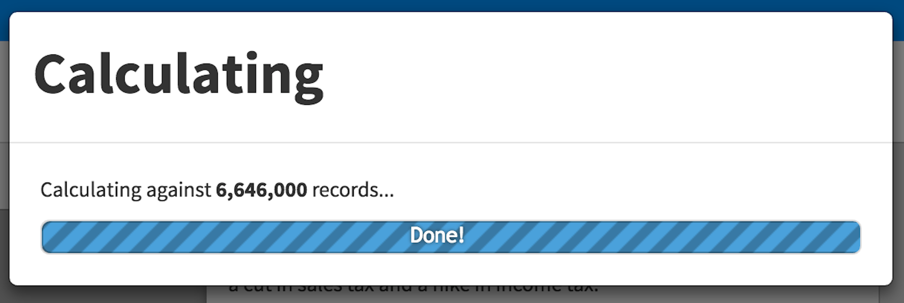
Fake Loading Bar
Second, a loading bar was added. It was not enough to just add the additional "Calculate Impacts" button; users did not believe calculations were happening. The loading bar, while fake, communicated to users that calculations were indeed happening. People expect that thousands of calculations on millions of records should some time. Without any sort of progress bar, the user's expectations were subverted in an unhelpful way which undermined their trust in the entire product. So, a fake loading bar is shown after clicking "calculate", which finishes in a matter of seconds and quickly counts up from zero to six million.
The loading bar finishes quickly. This establishes positive user expectations. People expect loading bars to indicate that work is being done. People also often expect loading bars to be painfully slow. We reaped the first benefit but upset the expectation of slowness by making the loading bar finish quickly and cycle through numbers. The result: nearly everyone not only trusted the calculations, but they were were surprised by the speed.
Conclusion
Outline was "SimCity" for real life. Visualizations were created to communicate financial impacts of public policy proposals a small individual level and a larger community level. A microsimulator was created which used parallel programming to calculate impacts in fractions of a second. But, because of user expectations, additional design steps had to to taken to make the speed believable.
Calculation Process
Overall, Outline was able to successfully accomplish its goals. The one area we failed, though, was delivering it to the general public at a large scale. Because we were unable to work successfully with state governments, we unfortunately were unable to see a public launch. However, our methods led to improvements on existing processes. From what I learned working on Outline, we pursued a new direction with Five Labs.