The best data visualization choice is not always the "correct" one. The most accurate representation of data is not inherently the best method of visualization. How well the visualization represents the data is probably the most important facet to consider when designing a visualization, but it’s certainly not the only one. It’s about what's best for the data and what experience you’re trying to create.
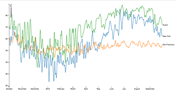
Daily temperature measurements are objective. Either it was 76 degrees or it was not. You can graph the daily temperatures on a line chart and get a clear understanding of objective data.

It isn’t always this simple. Sometimes, the data itself is more subjective or nebulous. Fuzzy. Sometimes, the story you’re telling can have multiple and equally valid interpretations. For instance, personality data is a bit nebulous. It’s an attempt to measure and classify irrational human behavior; behavior which is affected by mood, emotions, or manipulation. Using a precise representation of “inaccurate” data is, to me, a bit like using a 3D pie chart to represent objective data (e.g., % of votes for a presidential candidate). When data is nebulous, a more nebulous data visualization choice is a better fit.
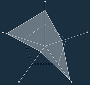
Five Labs uses Radar Charts (also known as Spider Charts). They're not the pinnacle of data viz. The first (among many) problems is that Radar Charts are in Polar Coordinates. (Don't worry - it's just a fancy way to say it's a circle.) Humans are bad at processing information encoded in circles. We see in x and y; length and width. We can’t easily process angles or radians.
Cartesian vs. Polar Coordinates (Bar vs. Pie Charts)
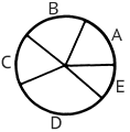
Below is a pie chart. Don’t spend more than a couple seconds looking at it. By just glancing at it, can you tell how different "B" and "D" are? Are "A" and "C" equal?

With pie charts, you get a fuzzy understanding of the data. Even if you stare at it for a while, there's a good chance you can't tell that A is bigger than C. At least, I couldn’t. When you look at a pie chart, your brain measures the angles of the slices. You can also try to measure the total area contained by each slice, but that’s even trickier. Donut charts (or ring charts - pie charts with a hole) suffer from this at an even greater level since it’s harder to perceive the angles. Perception is fundamental in data viz. If you can’t quickly and accurately perceive the represented data, the visualization fails.
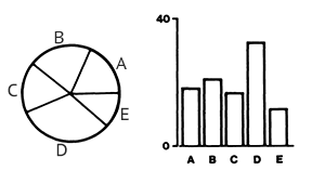
Now, take a look at a bar chart which represents the same data.

The representation of the data influences (or even determines) the conclusions you draw from it. When the bar chart and pie chart are side by side, it's hard to accept that they represent the same data. If some objective data is to be visualized, there’s little justification for choosing a pie chart over a bar chart. There may be artistic or aesthetic reasons for doing so, but pie charts are the inferior way to convey objective information. But, they may be better at representing subjective data.
Subjective Data
Let’s take a survey. Are you lonely? “Yes” or “No.”
Imagine we ask ninety nine other people this question and chart the results. How many people are lonely? From the examples above, using a bar chart would give us a more accurate perception of the data. I argue that it wouldn’t be the best choice.
The problem with this kind of data is that it’s nebulous and abstract and subjective and fuzzy and open to interpretation. Does “loneliness” have the same meaning to everyone? Should you always answer “no” if you have close friends? Or if you're in a relationship? Is 47% lonely a “no” or “yes”? Your answer also depends on the mood you’re in when you answered the question. There are a myriad of the other issues with such a simple yes/no choice, but even if you could answer on a scale of 1 to 5, many of the same issues exist.
Bar charts give us a more accurate representation of the data, but the problem with this example is that the data is nebulous. Fuzzy. Bar charts effectively communicate data in a clean, precise way. In the previous bar chart example, it’s obvious that “A” was bigger than “C”. Bar charts seem to naturally imply a sort of “correctness” about the data they represent.
From a perception perspective, is a bar chart the right fit for the data in this “lonely” thought experiment? I think they’re not, because it’s too tempting to draw the conclusion that the data is final or leaves no room for interpretation. In this scenario, a pie chart is a better choice because they give you a fuzzy representation of the data. In this case, the data itself is fuzzy.
Radar Charts

Radar charts have similar problems that pie charts have: a radar chart is essentially a bar chart that looks like a line chart rotated around a circle. The dimensions in a radar chart are related, but they are not parts of a whole like a pie chart. The shape of a radar chart is arbitrary - you can change the order of the dimensions and get a different shape. Comparing values across dimensions in a radar chart is difficult. Alone, a radar chart isn't a great visualization choice for objective data.
On the other hand, they create interesting shapes. This is the important part. When looking at many radar charts together (i.e., small multiples), they excel. They stand out because of their shape differences. When you look at a list of radar charts, it's easy to quickly spot outliers because they look so different. These differences represent differences in data. For objective data, a list of radar charts works wonderfully. Also, they’re my favorite type of visualization - even though I dislike pie charts.
For Five Labs, I wanted to use a visualization that was interesting and compelling on its own and worked great when looking at multiple versions of it. We use state of the art machine learning algorithms to predict your personality, but no matter how great they are, they are still just predictions. They’re predictions based on externally demonstrated behaviors of humans. How much rationality can we throw at an inherently irrational subject like human nature?
Conclusion
Sometimes, the stories that a visualization creates are more important than being able to accurately judge the data. This is especially true if the data you're representing is fuzzy. Personality data is some of fuzziest data you can represent. The nature of the data is not only subjective; it's ambiguous. What's the difference between 85% and 87% extraversion? What does that even truly mean? So, I think ambiguity in the visualization is more honest. In this case, the weaknesses of the radar chart are its strengths.
To me, a bar chart implies a high level of trust and accuracy in the data. No doubt about what the data shows. Even if you knew with full certainty someone's personality, how would you visualize it? Their behavior and actions on any given day are influenced by their mood, the weather, their health, etc. - factors that cause ambiguity.
There's no perfect chart for every situation. Listen to the data. Be aware of not only the results it gives you, but the source and reliability of those results. That reliability should be reflected in the visualization.